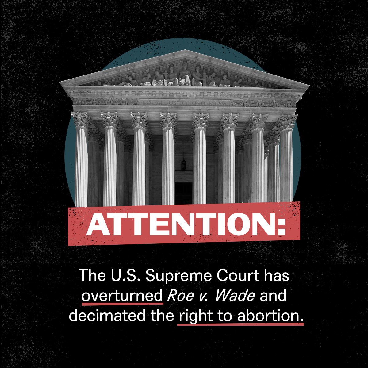
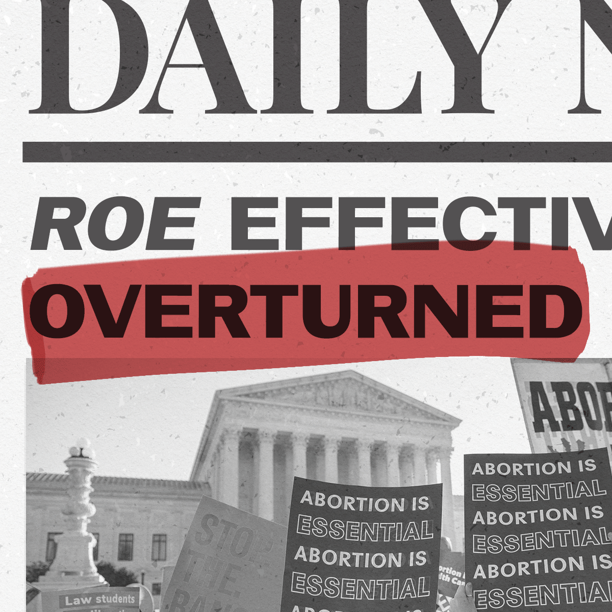
In Fall 2021 the Center for Reproductive Rights was preparing for oral arguments in the Supreme Court case Dobbs v. Jackson Women’s Health Organization — the case that ‘overturned Roe v. Wade.’
I collaborated with the CRR team through Summer 2022 adapting a limiting sub-brand to better suit their needs and the tone of the moment, responding to the leaked opinion, and later, the final decision and the aftermath.
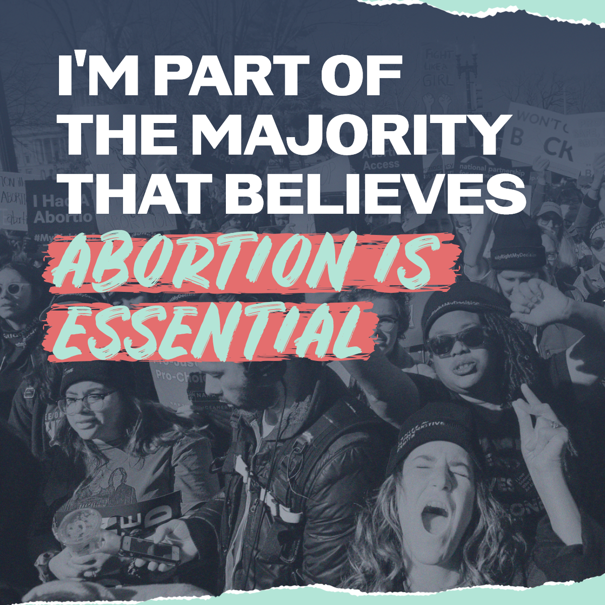
Over the course of this project my work appeared on a billboard in Times Square, in Variety magazine, and the social media of other top repro organizations and celebrity advocates with a shared fight. Ultimately, the creative helped CRR grow their list size by 30%.
Creative Oversight: Missy Kurzweil
Design: Shannon Kelly
Copy: Ejolee Mitchell
Center for Reproductive Rights Supreme Court Case
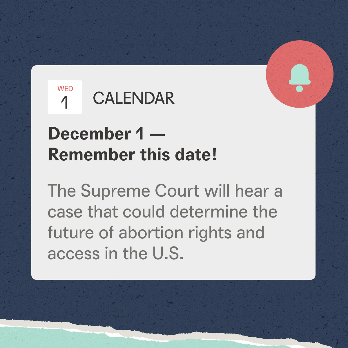
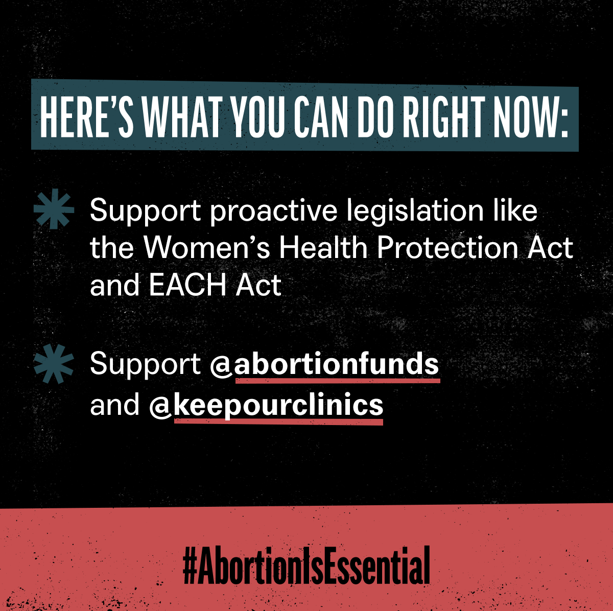
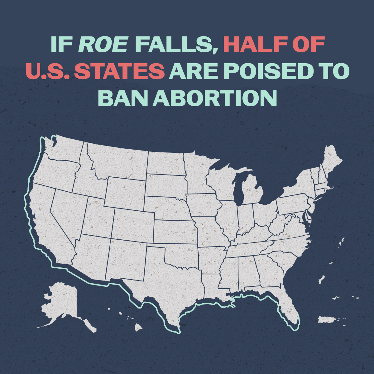
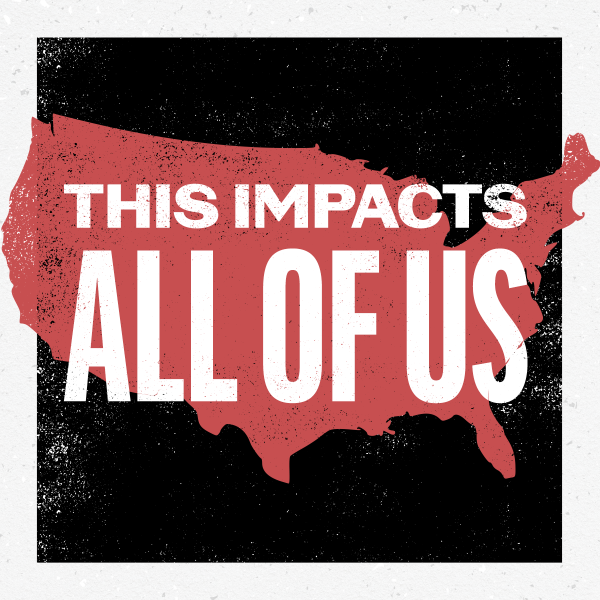
As the lawyers representing JWHO, the Center wanted to not only educate and engage the public on this critical case but also create a united front with other reproductive rights organizations in how the case was being communicated about.
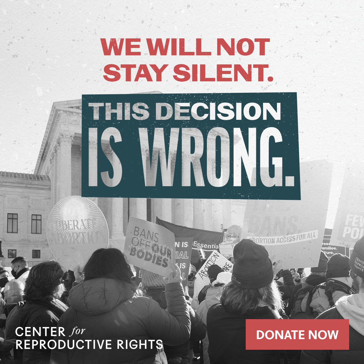
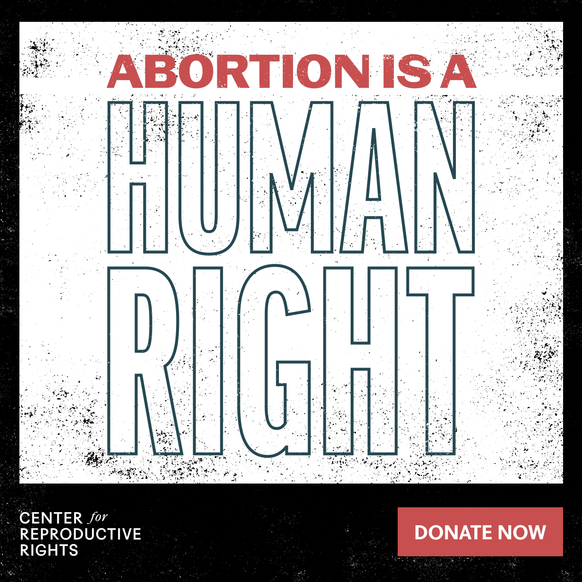
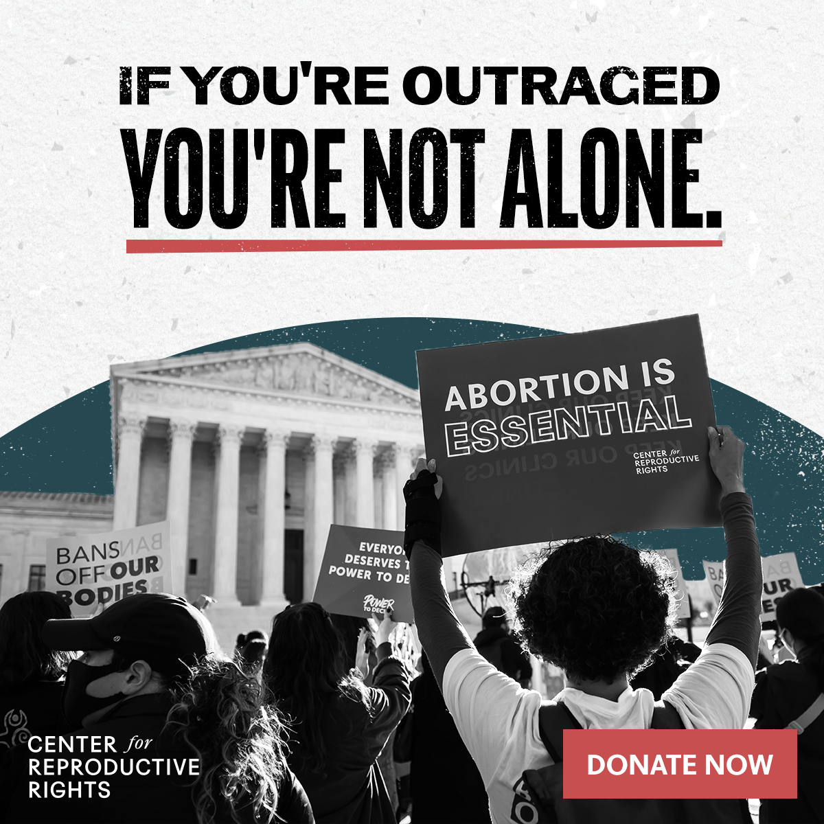
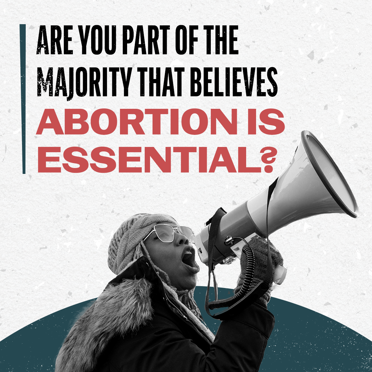
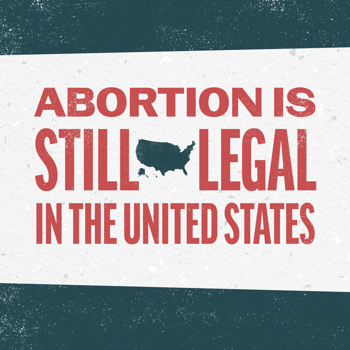
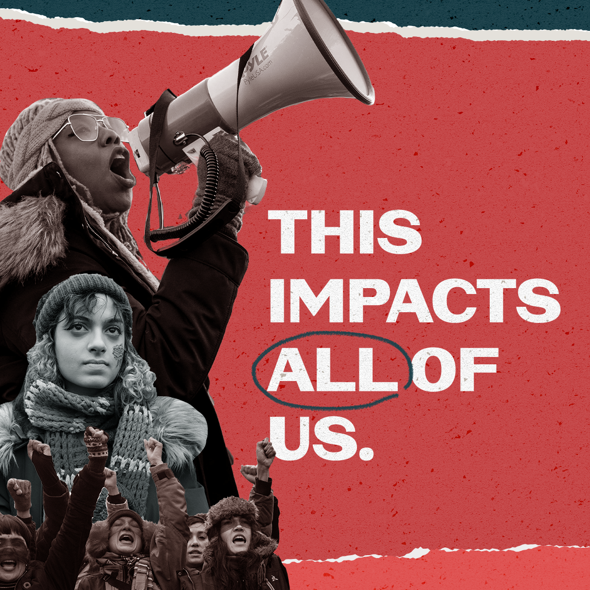
CRR developed a sub-brand for the initial phase of design. I was the design lead creating social toolkits that could be distributed to coalition organizations and influencer partners for their own organic social media, as well as paid media and web assets for CRR. The main objective was explaining just exactly what this case could mean for reproductive rights in the US and increasing public awareness.
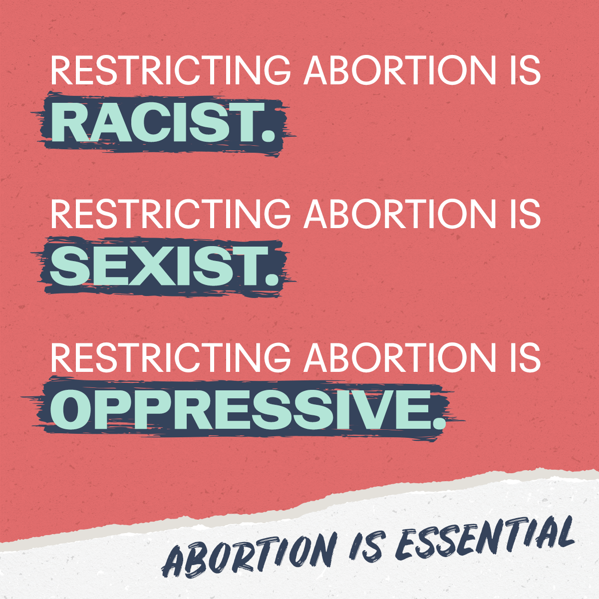
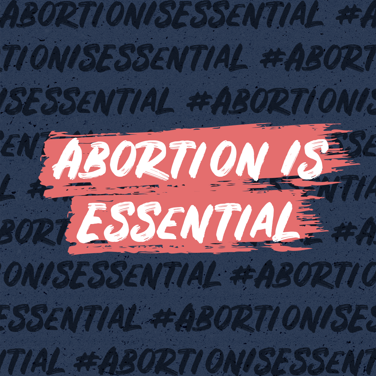
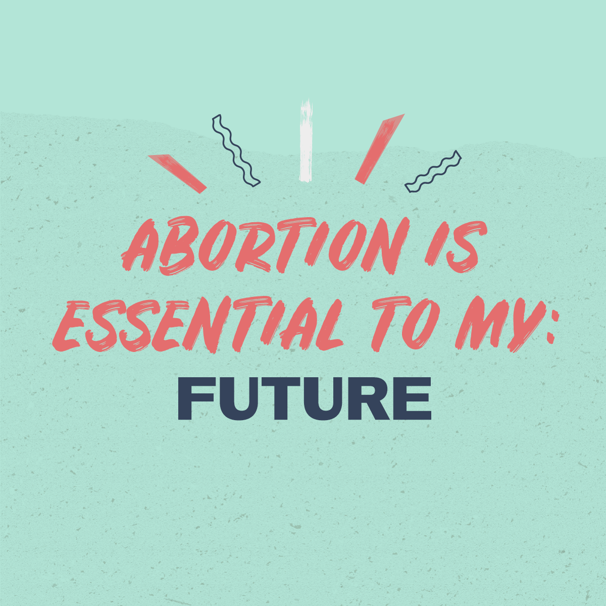
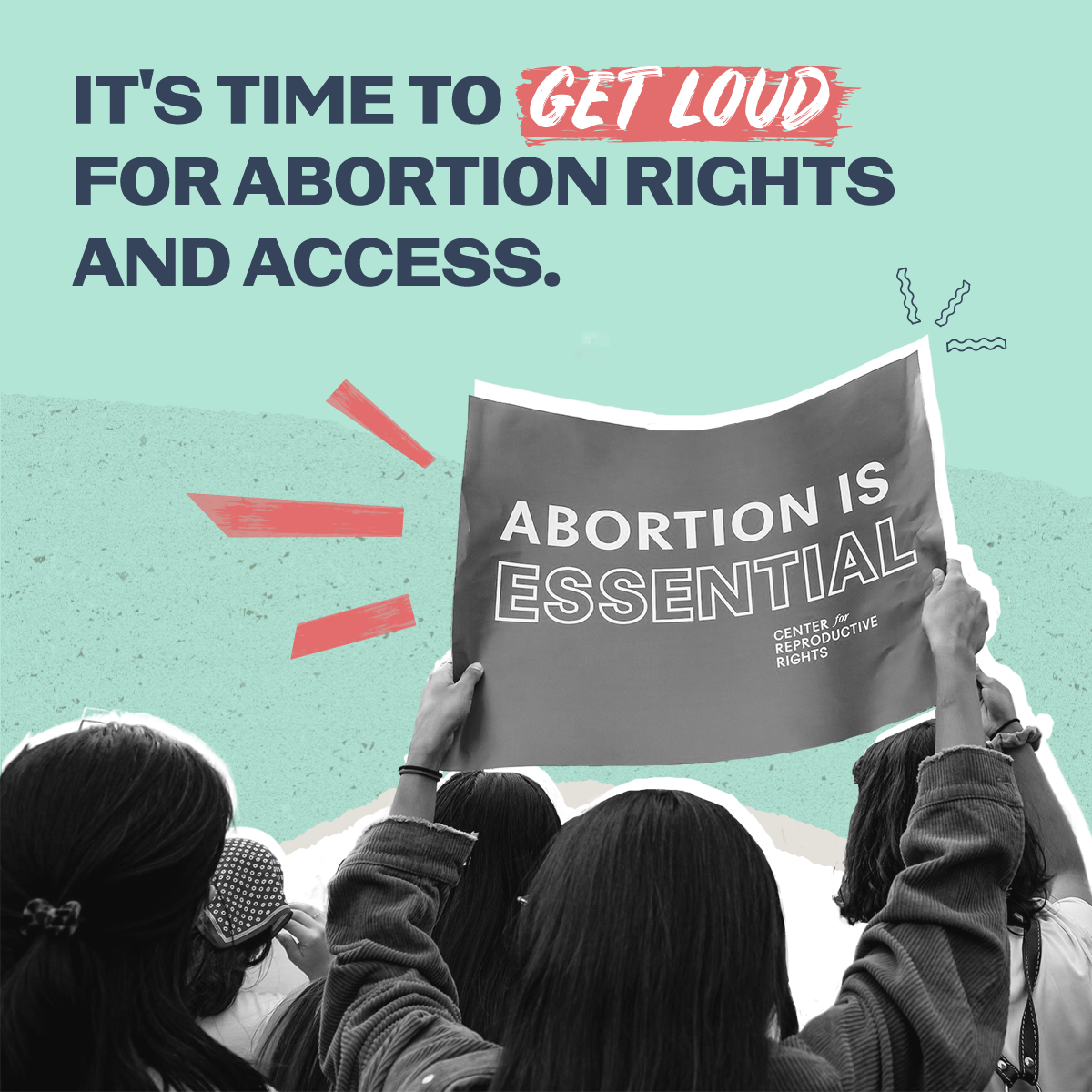
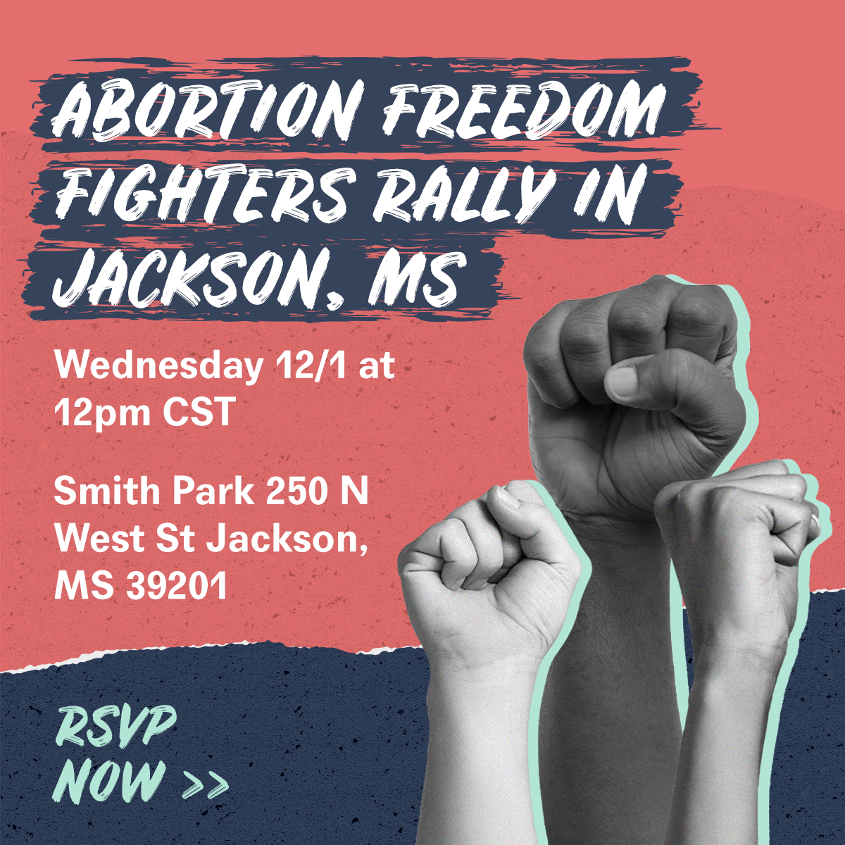
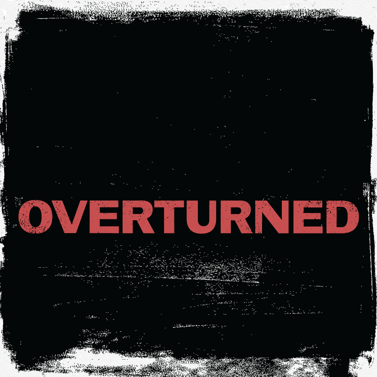
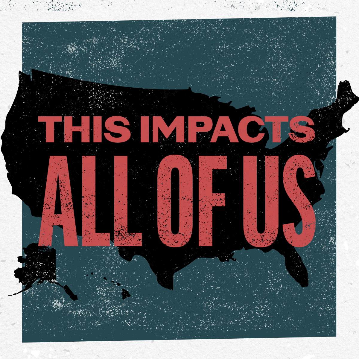
As my work with CRR progressed, it became clear that the sub-brand wasn’t a perfect fit. After the original toolkits came out CRR received feedback that it felt similar to the original Women’s March branding and we all felt the bright mint and coral were at odds with the content as more and more we prepared for a loss scenario.
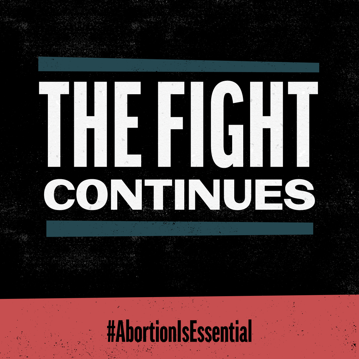
The clients also shared that some of their original inspiration for the campaign look and feel was 60s and 70s protest posters. With a better understanding of their vision, I proposed two potential new directions that borrowed some of the original elements of their sub-brand but darkened the palette to better suit the voice and tone. The art directions were grounded in the Constructivist movement and collage style of the 1917 Russian Revolution and classic, letterpress protest poster to tap into the visual history of revolution art.
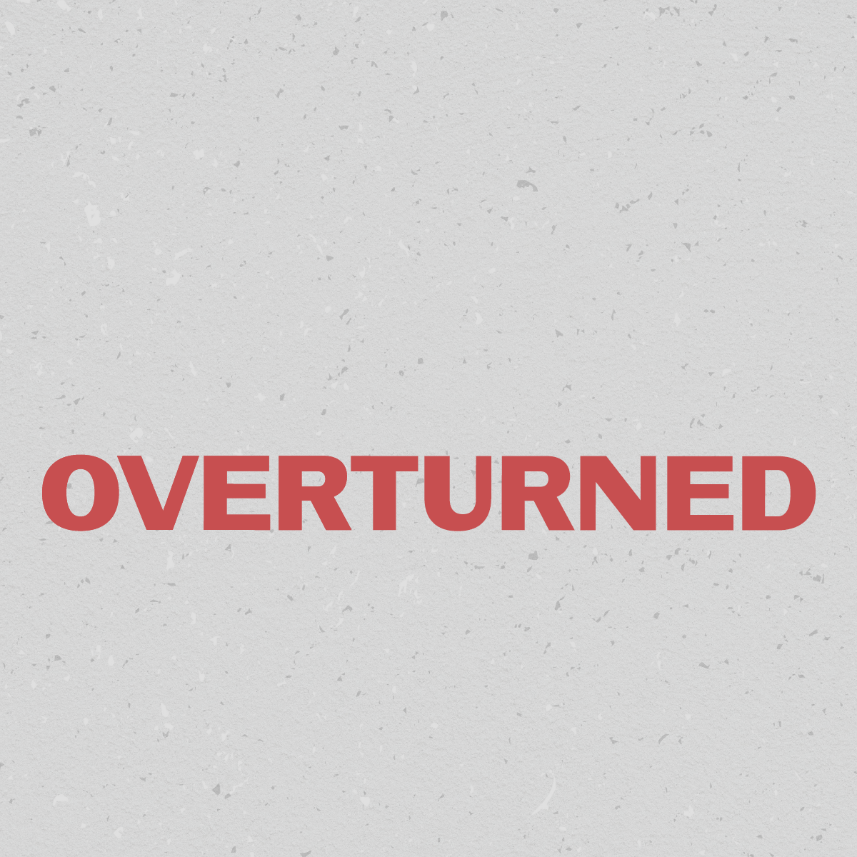
The colors, texture, and typography of the letterpress approach were a hit! Foundational elements connected the designs to the earlier toolkits we created and while the more tactile collage elements were gone, the ink texture was still a nod to a handmade process.